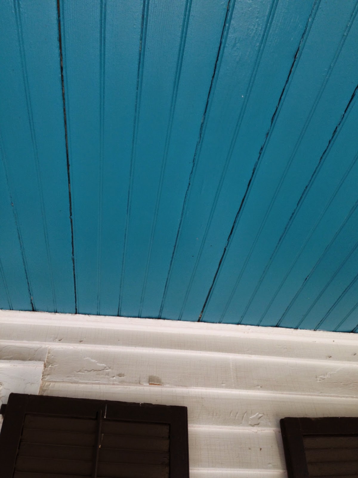
Today I'm going to show you the bare bones of my retail space. These are the original photos I shot on the initial walk through. I hadn't made my mind up to open an actual store front, but I thought it may be a sign that this space opened up in a location I'd had my eye on for awhile.
I loved the front porch (Can't you just see inviting chairs out there?)
The ceiling of the porch was turquoise...a color I've often adopted with Vivid Hue (a sign?)
The building was slotted for an exterior face lift even before I signed the lease. The entire exterior was sanded and scrubbed and resurfaced.
 |
| View of the Space from the Back Entrance |
And on the interior, there was one large room with two smaller office type rooms behind it. (Don't you *love* the paneling? More on this later)
One question I asked right from the beginning was whether or not I could paint or wallpaper over the wood paneling. The owner was very adamant about NOT disrupting this surface. He stated that it was part of the charm of this historical building (though the interior wood itself is not historical, he felt that it was part of this cottage's Connecticut charm). Note, the building itself is located in the historical district in our town and is from 1880. I asked if he'd consider letting me use a removable wallpaper as long as I left the paneling exactly in this state when I moved out. (As long as I provided a sample, he'd consider).
Another appealing aspect to me when I looked at this space, was that the lease term was only a year. To me, unsure of how this venture might turn out, I liked the idea of having the option to shut this down if it ended up being a total and complete flop. Lastly, I had researched retail space in other areas in Connecticut just down the road from Farmington, and the price of retail space in those areas was literally TEN TIMES more than this space. So, the lease price wouldn't break my budget, the lease term was only 1 year to start, the location was some place I frequented already and I felt was just BEGGING for a retail gift shop....
I pictured the wood paneled room to be the main selling space. The below photo is one of the back rooms with a door leading out to the parking lot. I envisioned this also being a potential selling space with the 3rd small room being used for excess inventory and my office. Cozy but doable.
In the end, it just seemed too good to be true. It seemed like an opportunity I just had to act upon. So I moved forward with pursuing the space.
That bench out front is just begging for some throw pillows and staging!
As I was in the lease negotiations, the exterior was undergoing a renovation. I knew it must be a positive sign when the owner/ landlord let me have input into the color of the door and porch ceiling.
Of course, I selected a vivid color! Benjamin Moore Poolside Blue! (What better way to let people know where I am...look for that turquoise door)
I had the back entrance door painted the same turquoise. The side and back have planters that aren't pictured here that I can fill with over flowing flowers in the spring and summer seasons.
And of course, if you'd like a sneak peek into the most recent developments with this space, follow me on instagram for daily photos.
xoxoxo Heather


7 comments:
Heather I am so thrilled for you, this is just the perfect space. Love that you painted the doors bright and inviting!! Cannot wait to hear more!
xoxo
Karena
The Arts by Karena New Feature
Love the turquoise you picked for the door, ceiling and window trims! Can't wait to follow along!
Jessie
www.mixandchic.com
It looks perfect, I like the wood paneling. I think it will go will be a good backdrop for what ever you are going to sell. Is there a bathroom and Is there enough parking?
It's amazing and such a charming place - can't wait to see more!!
Heather - The store is amazing and YOU are amazing. There is not a chance in the world you will flop! Did I miss what town it will be in? Do you have an opening date, because I want to put it on my calendar. xo
Good luck to you! It looks like it will be lovely. I'm in CT as well, closer to New Haven.
This is really getting good! Can't wait for the next "chapter"!
Love the door color and can just picture the flowers that will be coming in a month or so...
I'm excited to see what you do with the paneling......????
xo
Patty
Post a Comment