Showing posts with label Valentine's Day Tablescape. Show all posts

Wednesday, January 29, 2014

My Own Photos from Shoot

 It's been so fun to hear feedback from my Vivid Hue "Homies" about the article in Hartford Magazine about Vivid Hue.  (If you missed me announcing this from the rooftops, visit here for details). 

I promised I'd share more photos from the day of the photo shoot.  These are photos I snapped before the photographer and writer arrived. 

The shoot was scheduled for a Monday in December.  I had most of the house decked out in Christmas holiday décor.   I knew the focus of the shoot would be around the Valentine's Day "Tea Party" table so I spent most of my energy styling the dining room table.  (In fact, I started slowly setting the table in November around before Thanksgiving!)  The mag mentioned that they wanted kitchen shots as well...
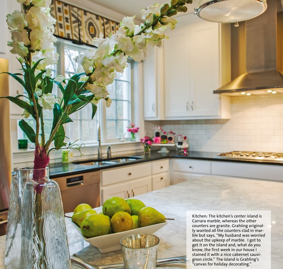
Kitchen Island

I usually like to use "non-traditional" colors for a holiday (e.g., instead of red and green at Christmas, I may use gold and eggplant; and instead of pink and red at Valentine's I use neutral flowers and magenta). 

Kitchen Table

Dining Room Bar Cart

I was dying for a bar cart before the shoot and convinced EG to allow me to get the Libations Cart from Crate and Barrel.  Initially, I considered loading the cart up with booze, but I could never stop downing the bottles long enough to display them.  But truthfully, I'm more of a wine and beer drinker so we didn't have much liquor to display.  That's when I got the idea to style the cart as a "side table."
I found the Target lamp on a dime ($14.99 on clearance) and scored the Miles Redd book at Antro on major sale ($25).  The rest fell into place!


 These little cupcakes didn't make the final cut in the magazine.  We had a great time making (and eating) the "props" from the shoot!  Also, only one tea cup was displayed so it wasn't apparent that each place setting had a different colored cup.  (PS- not complaining about the final photos in the magazine!  I'm thrilled with the vast number of spaces they displayed in my house). 


This angle of the flowers down the middle of the table looks busy! 


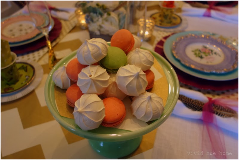
These assorted macaroons made it into the final cut in the header page!  These little guys sat on this plate for about a month (in prep for the shoot).  They went straight to the trash after!


And the shoot motivated me to restyle the inside of my dining room hutch! 
Dining Table

Kitchen


These candy jars moved multiple times before settling in the corner of the kitchen.  (I tried them in the dining hutch and on the kitchen island first).  Yes, it bugs the heck out of me that I erased the words "Vivid Hue" from the marshmallow jar and never rewrote it back...that's why only "Home" is on the label!  I started downing Chardonnay at 11am the morning of the shoot to ease the nerves so this detail went completely unnoticed until it showed up in print! 


This was an entire day process.   The team arrived around 10:30am and the photographer finished around 2:30pm.  Then I had my interview with Krystian until about 4pm.  What a fun filled and exciting day! 


PS--It seems when it rains, it pours...I will have some more good news to share with you in a few months! 


Tuesday, January 21, 2014

Vivid Hue debuts in Print

I have exciting news to share!  I'm in print!  I'm being featured in the February 2014 Hartford Magazine! 


I have more to share about this, including a link to the actual feature when it becomes available! (and more photos)   I will also dish about the fabulous photo shoot that took place back in December to prepare for this.

In the meantime, you can check out more of my house under house tour and Vivid Hue Home projects here.   

Thank you to Krystian Von Speidel for this wonderfully written article and to Mark Mirko for the amazing photographs.  It was a pleasure to work with both of you (and what a terrific experience!) 

Cheers!
Heather | Vivid Hue Home

Tuesday, February 12, 2013

Valentine's Day Tablescape #3: Masculine

 
Welcome to the third day of Valentine's Day tablescapes by Vivid Hue Home. 
If you missed #1 Whimsical Tablescape, click here and #2 Elegant Tablescape, click here. 

Now, #3 Masculine Valentine's Day Tablescape


Granted, this is definitely not a traditional Valentine's Day tablescape.   I just thought it may be fun to throw it into the mix because not everyone loves the lovey dovey mushiness of Valentine's day!  And maybe you're one of those people that likes to completely steer clear of tradition in every sense of the word! 


Sources: Tablecloth:  This is a remnant piece of fabric from JoAnn's.  (I don't recall the name).  Placemats:  Pomegranate from One Kings Lane Plates: Crate and Barrel  Centerpiece:  Home Goods (I purchased it spray painted gray all over like this then I added the peacock feather and yes, I even added those little dollops of yellow flowers for one occasion then never removed them, ha).  I've had fun with this little thing and it could easily cross over to the tacky side in two seconds flat.   Ceramic Apples:  Home Goods Twine Candle Holders: I made them.  Click here to check out my Nantucket Post from My Crafty Home Life


So, which tablescape is  your favorite; whimsical, elegant or masculine?

 #1 Whimsical:


#2 Elegant


#3 Masculine


Do you have big plans for Valentine's Day?  Will you celebrate by going out to eat or making a dinner at home?

Heather | Vivid Hue Home

Sunday, February 10, 2013

Valentine's Tablescape #2: Elegant


Yesterday I shared with you the first (whimsical) Valentine's Day Tablescape that I made during the winter  storm.   (Recall here).  Today, here is the second tablescape, a bit more elegant!  I used the same tablecloth as the base (this is really a swatch of fabric from Calico Corners that I had planned to use in Vivi's playroom).    I used two more swatches of fabric as runners across the table. 


Sources:  
Tablecloth: Remnant fabric from Calico Corners (I believe it's Mill Creek Raymond Waites). I ironed all four corners down for a straight "seam" around the edges.
Runners:   Remnant fabrics that I found from Jo Ann fabrics that I've used for table centerpieces for years.  I folded the edges of the fabric underneath to simulate a "runner" on the table. 

Plates: Home Goods Napkins:  White linen tied with twine with felt heart stickers adhered to the ends for decoration.  Wishbone:  Z Gallerie  Cake stand and Pitcher:  Home Goods  **** garland
I had fun and made some Valentine's Day garland above the table.  I used baker's twin and heart felt stickers.  I stuck the stickers to the twine (and put two stickers back to back so they stuck to each other).  Easy as pie and no glue needed). 


Which tablescape do you prefer?  #1 Whimsical or #2 Elegant? 

#1 Whimsical


#2 Elegant


Tomorrow check back for the Masculine Valentine's Day Tablescape!

xoxo
Heather | Vivid Hue Home


Saturday, February 9, 2013

Valentine's Tablescape #1: Whimsical

 
Talk about 'the perfect storm.'  It was Friday afternoon and everywhere in New England was shutting down early in anticipation of the snow that was heading our way.  I was taking the kids on a trip to the craft store in the middle of the storm so we could load up on Valentine's making supplies for the weekend so we'd have plenty of crafts to do.  So I decided to turn my afternoon into making different Valentine's day tablescapes. 
 
Usually, I'm not one to decorate with the expected colors for a holiday (e.g. at Christmas, I don't typically use the traditional red and green).  So I surprised even myself that I selected red and pink for these Valentine's Tablescapes.   It turns out I had all of these supplies on hand, except the red runners...which are simply red wrapping paper made into runners.  So using these colors was a no brainer. 

Today I'm going to share the first tablescape with you.  I'm calling it Whimsical! 
 #1 Whimsical


Sources: 
 Tablecloth: I started with a simple swatch of fabric from Calico Corners (I believe it's Mill Creek Raymond Waites).  I ironed all four corners down for a straight "seam" around the edges. 
Runner: I decided on a red table runner and used red "wrapping paper" from Michael's (see the prep photo here).   |  Butterfly Placemats: Marshall's $1.99  | Napkins:  By Mahogany from Home Goods | Plates:  Crate and Barrel   | Red + White Straws:  Michael's $1.99  Frames:  Michael's $1.99


Hope you enjoyed the first tablescape! 

Check back tomorrow for #2 Elegant and the next day #3 Masculine~!

xoxo
Heather
Vivid Hue Home