Wednesday, February 29, 2012

Lonny's Back!


Set if free and, if it's meant to be, it will return

Well it seems Lonny mag is meant to be
It will be returning March 10th for bi-monthly issues! 


Sunday, February 26, 2012

Sky's The Limit- Painted Ceilings

One of my favorite design tricks is to paint the ceiling in a room.   
Use the same color as the walls...or venture out and try an alternate shade that compliments them.


Painting the ceiling elongates a room.  It creates continuity in the flow of the design.  Rather than halting  the eye abruptly with a white ceiling, the effect is much softer


I used two complementary colors in my formal powder room.  The ceiling is painted Benjamin Moore Gull Wing Gray.  The walls are painted Benjamin Moore Revere Pewter.  I hung a pendant chandelier lamp as the main light source and the light radiates off the ceiling.  I wouldn't have accomplished the same affect with white paint. 


Vivid Hue Home Powder Room

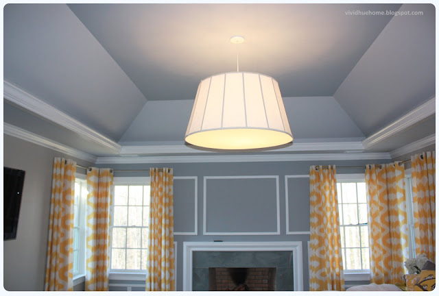
In my master, the tray ceiling is painted Benjamin Moore Gull Wing Gray too.  Because the pendant lamp in that room is so large, it immediately draws the eye toward the ceiling.  

The painted ceiling creates a soft warmth in the room.

Vivid Hue Home Master Bedroom


Don't be afraid to use more bold colors on the ceiling.  I carried the robin egg blue hue to the ceiling in my sunroom with Benjamin Moore's Spectra Blue.  It helps draw attention to the chandelier. 


Check out more sunroom here

It's "old school" to think that a painted ceiling puts a "lid" on the room and makes it feel smaller.  In my opinion, it's quite the opposite


It's another way to add character to a room.  Have fun.  Worse case, you'll have to repaint
another color if you don't like it!


If you have examples of rooms in your house with painted ceilings, please send them my way! 
I'd love to use them in future posts.


Don't take yourself too seriously when decorating a room.  In most cases,  the decor can always be changed, so have fun!

Psst, ever thought about painting your hardwood floors?  Check them out here.


Saturday, February 25, 2012

House Tour: Sun Room


As you know by now, I'm a huge believer in mixing colors and patterns in my style. 

I think it adds character and I love when you can expect the unexpected.  When we built our house, my husband EG had his man study included in the plans so he could work at home when needed.  My dream was to have a sun room with windows from wall to wall.  This was to be my study.  It has since become the room we call "the relaxation room."  It's one of the only rooms in our home that doesn't have a TV mounted to the wall. 

Welcome to my Sun room Tour   

The first decision I made in this room was the rug.  I love Company C and loved the pattern and color choices of this rug.  This set the stage for the rest of the room. 


This Anthro chandelier was on sale and I knew I could find a place for it in my home.  I grabbed it before the room was even finished.  I love the circle bulbs over a traditional candle shape because they add a pop of modern to an otherwise shabby chic style.


Sometimes it's hard to "get style right" the first time...initially I had the ceiling painted Benjamin Moore Spectra Blue and the main walls in Benjamin Moore Posey Pink (to match some of the colors in the chandelier). 


It looked more like pepto bismol primer paint so we updated with a deeper turquoise blue (thank goodness!).  Now the ceiling and main walls share the same color with slightly different hues


The sofa has a faint pinstripe of mint green and beige.  Subtle but still adds a layer of pattern.


I love love love Trina Turk Home accessories so added these pillows for an extra pop. 


I found the Oly Pipa Cocktail table at Layla Grayce.  It reminds me of Christmas Ribbon Candy.  Yummy.


And of course, every coffee table needs Grace Bonney's d*sponge book!  I'm so inspired with what she has been able to turn Design Sponge into.  She had no formal design training and...well I could gush about Design Sponge all day long. Ahhh...some day maybe that will be me.


These chairs are custom Lee Industries by Lillian August.  I'm all about using a contrast welt to add extra definition to a chair. 


The bird pillows were spotted by my sister in a cute little homeshop in Kennebunkport


I'm glad she urged me to buy these because now they remind me of our annual summer trip to the beach. 
The oblong pillow is Pier 1.  It looks handmade and I love that about it. 

The console is Bungalow 5.  I love the details of the nail heads that surround the perimeter.  Remember my post about Foo Dog's? Here are my foo's!


Here's my Vivi
She's a ham
And clearly she believes
in mixing patterns too!


I bought two matching Bungalow 5 side tables for both sides of the couch.  This seems silly but it wasn't until the last few years that I realized it's important to the eye to have symmetry in a room.  Pair off a bed with two side tables or two matching lamps.  Now of course there are ways to play with symmetry so it's not so cookie cutter.  I'll discuss that in future posts. 


The fun in decorating is in the details.  Sometimes they're the last to get the attention


Accessories can be a pretty bowl of fresh flowers.  Fun coasters.  Always birds.


Meet our family pet.  I fell in love with him when I spotted him in Home Goods.  My kids are all about dogs.  But we will never have one.  EG is deathly allergic (please don't tell me about the hypo-allergenic dogs...he starts sneezing even when you speak of them).  This is the closest we'll ever get to the real thing. 
 

Accessorizing does not have to be expensive. 
I found the lamps with the basket weave lime shades at Home Goods for $25 each.  Steal!


Jonathan Adler, Lonny Mag (RIP), my favs!
(thought Lonny was only an online mag?  well I think I'm the only sucker that paid $30 for one issue because I desperately have to leaf through the pages of a magazine)!


My homage to One Kings Lane.  The signature Elephants.  There was a time when I think I seriously needed a 12 step program to break my habit of buying something from them weekly...(Read more on my thoughts about OKL here)


My little guys
Vivster and Jackers.  These were photos I took and had them put onto canvas as a Father's Day present for EG last year.


Remember my love of Massimo Vitali prints? 
Here's where mine will go someday!


Hope you enjoyed the tour. 
 
See other room tours here


Don't forget to "like" me on my Vivid Hue Home facebook page here


Friday, February 24, 2012

Spring with Lilly!

Spring wants to be here just as badly as I want it to be.  The daffodils are in bloom already and the temperatures are almost 60 degrees. 


So why oh why did I wake up to a snow day today?  The kids had a delayed opening and the ground was filled with five inches of powdery white stuff.  huh? 


I'm hoping today's weather is just a small blip in Mother Nature's plans.  Get here already Spring!


I came across these wonderfully cheerful images in my portfolio.  I absolutely love Lilly Pulitzer Home


In fact, before the furniture line officially launched last summer, I frantically stalked searched blogs that carried sneak peaks to the products.


I'm sharing these with you because I think you'll be equally energized by them   And it couldn't hurt to have more people wishing for spring...maybe Mother Earth will listen to us.  (fat chance). 


Look out for spring!  It's around the corner. 


I love Lilly's looks! 


I had a few days of hiatus from posting.  My *real* life has taken over for a few days, but I have some fun posts coming your way for next week.  In the meantime, think fun colorful thoughts of spring!


Wednesday, February 22, 2012

Blogging with Bunny and Bonney

So it seems like if you're *anybody* among *anyone* in the interior design blogosphere, you should be going to the Design Blogger's 2012 Conference in Los Angeles 


One King's Lane will be there.  Martyn Lawrence Bullard is the guest speaker.


February 26-28th in Los Angeles,. California at the Biltmore Hotel.   


The fabulous Bunny Williams will be a guest speaker at the conference!


And Cassandra Lavalle of coco + kelly fame will be there too!  It's the who's who among the design world! 


Joss & Main will be there!  One Kings Lane will be there!
Dwell with Dignity will be there!

Will YOU be there? 


and don't forget to tell the rest of us about your experience!


Monday, February 20, 2012

Family "Joins" The Master


You may recall that I've been updating the master bedroom.  (You can check out the before and "in progress" pictures here).


This weekend, I finished my family silhouettes and added them to the master above the bed.   
I first taped the wall to ensure proper placement (and to limit the number of aimless nail holes it usually takes until I get it right). 


One by one, each member of our family joined the wall. 


I don't think I showed the fabulous steel blue
pagoda lamps in my last progress.  I love these guys. 


The yellow nightstands are temporary and will be replaced by these:


I think the marshmallow studly
dresser will allow the pagoda lamp to really pop! 


I also decided to put my Ribbon Louis XV chair upstairs in the room as a temporary placement until I find out if the gray fireside chairs will fit in there.  I fell in love with this Dransfield and Ross chair for it's color.  And you know by now, I love my color


This continues to be a work in progress.  I will be updating the accessories, adding pillows, updating the bedding and a throw.  All in due time. 

For now, my next DIY project is to reupholster a vanity stool to replace this $6 stool from Ikea that I've used for years!  Stay tuned for the updated stool!


Until next time.  xoxo